Android Compose UI Toolkit

Jetpack Compose is a modern toolkit for building native Android UI. Jetpack Compose simplifies and accelerates UI development on Android with less code, powerful tools, and intuitive Kotlin APIs based on Google’s modern toolkit and brought to you by JetBrains.
Structure
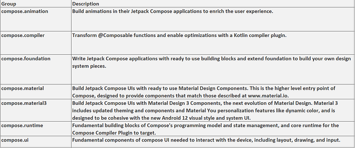
Compose is combination of 7 Maven Group Ids within androidx. Each Group contains a targeted subset of functionality, each with it's own set of release notes.
This table explains each set of release notes.

Declaring dependencies
To add a dependency on Compose, you must add the Google Maven repository to your project. Read Google’s Maven repository for more information.
Add the dependencies for the artifacts you need in the build.gradle file for your app or module:
dependencies {
    implementation("androidx.compose.ui:ui:1.3.0-beta02")
}android {
    buildFeatures {
        compose = true
    }    composeOptions {
        kotlinCompilerExtensionVersion = "1.3.0-beta02"
    }    kotlinOptions {
        jvmTarget = "1.8"
    }
}
What are the Benefits of Using Jetpack Compose?
- Declarative: It is fully declarative so that you can describe your UI components by calling some predefined functions.
- Compatible: It is easily compatible with the existing views present in Android.
- Increase development speed: Previously developers have to work on the XML file and Kotlin file. But with the help of jetpack compose this becomes easy and developers only have to work on the Kotlin files that’s why it will help developers in increasing development speed.
- Concise and Idiomatic Kotlin: Jetpack Compose built the UI with the benefit that Kotlin brings.
- Easy to maintain: As the codebase of any application is present in a single file. It becomes easy to manage and handle the codebase of the application.
- Written in Kotlin: The application written using jetpack compose uses 100 % of Kotlin programming language.
What Challenges Do We Can Solve using Jetpack Compose?
- When writing our code we create multiple methods for different purposes. After that we couple this method in our main function according to our requirement. In Android when building any type of view and setting data to that particular view. First of all, we initialize that view with a variable and then add data to that specific view. This process of coupling UI elements with the View Model is called Coupling. When our code is having so many couplings it becomes difficult to maintain this code. So coupling can give you sometimes some Null Reference errors.
- While developing apps in Java we generally prefer using View Modal concept in which we find each view from our XML layout file inside our Java class and add data to that specific view according to our requirement. In most apps, we use the UI elements to display dynamically so this may sometimes give you an error of NullRefrence. In this method, UI elements are declared in XML language whereas the functionality is written in java or Kotlin and we link UI elements with our Java or Kotlin class with the findViewbyId() method.
- If we will prefer to use the same language for writing our UI components and for adding the functionality it will become easier to maintain our code. By using this method the number of couplings inside our code will also reduce.
Some Basic Functions of Jetpack Compose
- Composable Function: Composable Function is represented in code by using @Composable annotation to the function name. This function will let you define your app’s UI programmatically by describing its shape and data dependencies rather than focusing on the UI construction process.
- Preview Function: The name of the function itself tells us that the function is used to generate the preview of the composable function. It is used to display a preview of our composable functions within our IDE rather than installing our APK in an emulator or a virtual device. The preview function is annotated by @Preview.
- Column Function: The column function is used to stack UI elements in a vertical manner. This function will stack all the children directly one after another in a vertical manner with no spacing between them. It is annotated with Column().
- Row Function: The row function is used to stack UI elements in a horizontal manner. This function will stack all the children one after the other in a horizontal manner with no spacing between them. It is annotated with Row().
- Box: A widget that is used to positioned elements one over another. It will position its children relative to its edges. The stack is used to draw the children which will overlap in the order that they are specified. It is annotated with Box().
- Spacer: It is used to give spacing between two views. We can specify the height and width of the box. It is an empty box that is used to give spacing between the views. It is annotated with Spacer().
- Vertical Scroll: If the UI components inside the app do not fit the height of the screen then we have to use the scrolling type of view. With the help of a vertical scroller, we can provide a vertically scrolling behavior to our view. The contents inside the vertical scroller will be clipped to the bounds of the vertical scroller. It is annotated with VerticalScroll().
- Padding: The padding function is used to provide extra white space according to the requirement around the specific view. It is simply annotated with Padding().
- Lazy List: This composable is equivalent to a recycler view in android’s view system. It is annotated with LazyColumn()
NOTE: To use Jetpack Compose, you need to have the latest Canary version of Android Studio 4.2. So, you can move over to the Android Studio Preview page and download the latest Canary version and then make an Empty Compose Activity.
Composable Function
In Jetpack Compose, Composable functions are used to define all the UI of your app programmatically. So, you need not use any XML files for the layout of the app. All you need to make a composable function is just by using the @Composable annotation to the function name. The basic syntax of a Composable function is:
@Composable
fun AnyUiComponent() {
    // Code for UI element
}
Now, you know what Composable Functions are and how to make a composable function by using the @Composable annotation. Let's move on to the example of Text.
Displaying a Simple Text
In this section of this tutorial, we are going to learn how to display a simple text using compose.
To display a text, we use Text Composable and inside that, we pass the string that we want to display. For example,
@Composable
fun SimpleText(displayText: String) {
    Text(text = displayText)
}
Here, SimpleText is a Composable function and inside that function, we are using Text and passing displayText into it.
Now, you can call this SimpleText function from the setContent block of the onCreate method of the activity.
class SimpleTextActivity : AppCompatActivity() {
    override fun onCreate(savedInstanceState: Bundle?) {
        super.onCreate(savedInstanceState)
        setContent {
            Column(
                modifier = Modifier.fillMaxSize(),
                verticalArrangement = Arrangement.Center,
                horizontalAlignment = Alignment.CenterHorizontally,
            ) {
                SimpleText(getString("I am learning Compose"))
            }
        }
    }
}
Here, we are using a Column that is used to display some content vertically and inside that Column, we are calling the SimpleText Composable function.
Applying Styles to a Text
We can apply various styles to a Text such as increasing the font size, changing the color, etc.
So, let’s make a function named SetTextStyling:
@Composable
fun SetTextStyling(displayText: String, style: TextStyle? = null, maxLines: Int? = null) {
    Text(
        text = displayText,
        modifier = Modifier.padding(16.dp),
        style = style ?: TextStyle.Default,
        overflow = TextOverflow.Ellipsis,
        maxLines = maxLines ?: Int.MAX_VALUE
    )
}
In the above function, the parameters are displayText i.e. the text to be displayed, style i.e. the style to be put on the Text, and maxLines i.e. the maximum number of lines allowed for the text. If the text is more than the maximum line, then ellipsis(…) will be shown.
We will call this function by passing these parameters. Let’s see some of these:
- To set font-size:
style = TextStyle(
    fontSize = 24.sp
)- To set font-weight, pass text-style as:
fontWeight = FontWeight.BoldSimilarly, you can change the font-Size, textColor, font-family, underline a text, etc. You can see all these from our Opensource Project.
Taking inputs using TextField
Just like EditText, in Compose we can use TextField and BaseTextField. BaseTextField is still experimental and can be removed or added permanently at any time. So, to use BaseTextField, you need to add @ExperimentalFoundationApi annotation.
The following is an example of a simple BaseTextField:
@ExperimentalFoundationApi
@Composable
fun SimpleTextFieldComponent() {
    Surface(color = Color.LightGray, modifier = Modifier.padding(16.dp)) {
        var text by remember { mutableStateOf(TextFieldValue("Enter text here")) }
        BaseTextField(
            value = text,
            modifier = Modifier.padding(16.dp).fillMaxWidth(),
            onValueChange = {
                text = it
            }
        )
    }
}
In the above function, we are having a BaseTextField inside a Surface. We have a callback named onValueChange. This callback is called when there is some change in the input to the BaseTextField and the updated text will come as a parameter from the callback.
This is an example of BaseTextField. The Material Design also provides one Composable for EditText i.e. TextField. A simple implementation of TextField is as below:
@Composable
fun SimpleMaterialTextFieldComponent() {
    var text by savedInstanceState { "" }
    TextField(
        value = text,
        modifier = Modifier.padding(16.dp).fillMaxWidth(),
        onValueChange = { text = it },
        label = { Text("Label") }
    )
}
TextField behaves similar to that of BaseTextField. Here in TextField, you have one more thing i.e. label. A label is a text that is displayed inside the TextField when there is no text in the TextField.
We can customize this BaseTextField and the TextField by passing various parameters to it. For example,
- To show only numerical keyboard:
var text by remember { mutableStateOf(TextFieldValue("0123")) }
BaseTextField(value = text,
    keyboardType = KeyboardType.Number,
    onValueChange = {
        text = it
    }
)- To take a password as an input:
keyboardType = KeyboardType.Password,
visualTransformation = PasswordVisualTransformation()- To add a placeholder in TextField(will be displayed when TextField is empty and focused)
placeholder = { Text("MindOrks") }Similarly, we can add icons, show error message in TextFiled, set errorColor, backgroundColor, intractionState, activeColor, inactiveColor, etc. You can find these on our Opensource Project.
You can try these and see the output in the Android Studio itself. Yes, you heard it right. You can preview any UI element in Android Studion itself. Let’s see how.
Preview in Android Studio
Android Studio provides an awesome feature of previewing your UI components in the studio itself and that too dynamically. So, whenever you want to test some UI components, then you can simply preview it in the Android Studio by making a Composable function and by using the @Preview annotation.
The following is an example of the same:
// This is a Composable function to display a Text
@Composable
fun SimpleText(displayText: String) {
    Text(text = displayText)
}@Preview
@Composable
fun SimpleTextPreview() {
    SimpleText("Hi I am learning Compose")
}
Now, in the preview tab(right-hand side of the Studio), you can see the preview of the above Composable function.
You can use as many previews as you want with different width and height. If you click on any of the UI elements in the preview, then the Android Studio will take you to the line where that UI is created.
Also, you can put some names to a Preview by using the name parameter. To name a preview you need to add the below code:
@Preview(name = "Named Preview")To use of sample Compose Ui demo you can check the Demo sample App link.
For more details you can read below official documentation :-
https://developer.android.com/jetpack/compose
