Android Jetpack Compose UI Part-1

Jetpack Compose is a way to write your UI directly in code with the use of Kotlin functions. As you write functions that represent UI widgets, you can compose them, reuse them and finally create awesome layouts for your app OR we can say in other words is that
Jetpack compose is about to revolutionize android development. We don’t need to use xml for layouts anymore. With Jetpack compose, we can very easily create all the views using Kotlin codes.
Project setup for Jetpack Compose
From Android studio click on File and then “New Project”, Then from New Project window select “Empty Compose Activity“.
And, do not forget to set minimum SDK level as 21 or higher. It is required to use Jetpack compose.
Finally, open the project level gradle file and set kotlin version to 1.5.10 . Which is the kotlinCompilerVersion of app level gradle file. These values might change in your project. However, all you need to do is setting it to the same value as kotlinCompilerVersion .
Then, change the compose version to “1.0.0-beta08” . Similarly, this value might also be changed by the time you read this tutorial. Just add the latest compose version there.
And, of course you must sync the gradle after this change.
App level gradle file.
So, now open the MainScreenActivity.kt. And, Switch to split mode. You might need to rebuild the project once, and click on “build and refresh” link on the preview window. If all the steps done correctly, you would see this.
If you run this app now, you will see “Hello Android” on the screen.
After project build setup done, we will see that here only setContent block with ComponentActivit() instead of setContentView() function call on AppCompatActivity().

Theme.kt
“KotlinDynamicJsonLibTheme” is the name of the theme class created for this project. If you name the project as “Abc”, then the name of the theme class will be “AbcTheme” . Press the “Ctrl” key and click on the “KotlinDynamicJsonLibTheme”. Then, Android Studio will open the Theme.kt file. We will study more about theming in a later tutorial of this tutorial series.
Surface
The surface block explicitly indicates that the code uses a material surface. we can use it to provide common surface to view components.
We can use it to set common attributes such as background color, border and elevation. Same as themes, we will study about surfaces more later in this tutorial series.
Actually, for a simple project like this, we do not require a theme block or surface block. Remove those two blocks and run the code. You will get the same result.
Composable Functions
In Jetpack compose, a UI component is simply a function with a composable annotation.
Unlike other function names, these function names start with an upper case letter.
From the setContent block we invoke “Greeting” function.
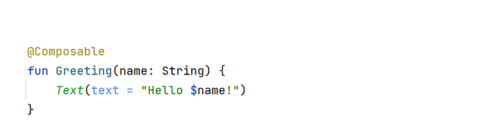
Goal of this function is displaying “Hello XYZ” Text on the screen.
To do that we need to invoke “Text()” function.
Text() is a Jetpack Compose Function.
When we invoke a compose function like that, Jetpack Compose library will use a custom Kotlin compiler plugin to transform that into a UI element. But, all jetpack compose functions are composable functions.
Since we are invoking a composable function from the “Greeting” function we must annotate “Greeting” function with @Composable.
Preview Functions
Android Studio allows us to preview our UI without having to open an emulator or connect to a device.
For that all we need to do is creating a composable function (without parameters) and annotating it with @Preview.
Then, we will invoke other composable functions from it to have a live preview.
You can update the previews at any time by clicking on the refresh button at the top of the preview window.

Composable functions have defined outside the class (MainScreenActivity)
If you study above code carefully you will see that two functions have defined outside of the MainScreenActivity.
In Kotlin, it is possible to define a function outside the class. We call them package level functions.
Defining them as package level functions, allows us to reuse them effectively.
How to use some basic Ui component in project
Here we will use some basic component's like:-
- Text (Same as TextView)
- Image (Same as Image View )
- Row/Column (For Arrange item in vertically or horizontally like Linear Layout)
- Card (Same as Card View)
- Button (Same as Button)
1. Text
Here we will use Text() composite function to create text view and parameter text = “${textObj}” is used to display text string what user want to show.

For more detail of each property will be describe in next part.
2. Image
To create imageView, We can use Image composite function and load image from all diffirent-2 sources , here i am loading image from url. To load image from url we will use rememberAsyncImagePainter function that’s comes from Coil library(io.coil-kt:coil-compose:2.0.0-rc01).

3. Row/Column
Row and Column used to arrange item in order , Like if want to arrange item in horizontal way use Row and If want to arrange item in vertical way use Column.


Inside property description we will read later.
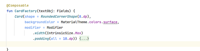
4. Card
To use cardView we will use Card composite function and for their shape we can use inside shape property where we can set the corner and other things.
5. Button
For button view use, We will use Button composite function and set the basic property to handle button like text, border and click event etc.

For More other component we will discuss later in next tutorial series.
Now check how can set padding and margin.
How can set padding/margin in UI component
Now we are going to learn how to set padding and margin in Android Jetpack Compose.
To set padding and Margin we must use Modifier class and with the use of their method’s like padding we can set the padding of the view.

To full detail of padding / margin, Check the below link
https://semicolonspace.com/jetpack-compose-padding-margin/
To read more about the Compose UI check Developer link or will discuss in the next part. Also you check checkout source code from here.


